Overview
Twitch is a brand rooted in energy, creativity, and community. The Twitch Community MeetUps site is meant to extend that spirit beyond the screen — giving streamers and fans a place to find and host real-world events.
However, the current site experience doesn’t fully capture that Twitch magic. When I first visited it, I felt disconnected from what makes Twitch so special: the immediacy, the sense of belonging, and the clarity of purpose. This sparked my decision to redesign the site — not just to make it look better, but to make it the user experience more smooth and make no user was confused while going though the website.
Problem Statement
Before starting the redesign, I conducted a full UX analysis of the Twitch Community MeetUps website to understand where the experience was falling short. My goal was to identify friction points in the user journey and uncover opportunities to make the platform more intuitive, inclusive, and aligned with Twitch’s community-driven identity.
Original Website with my annotations:
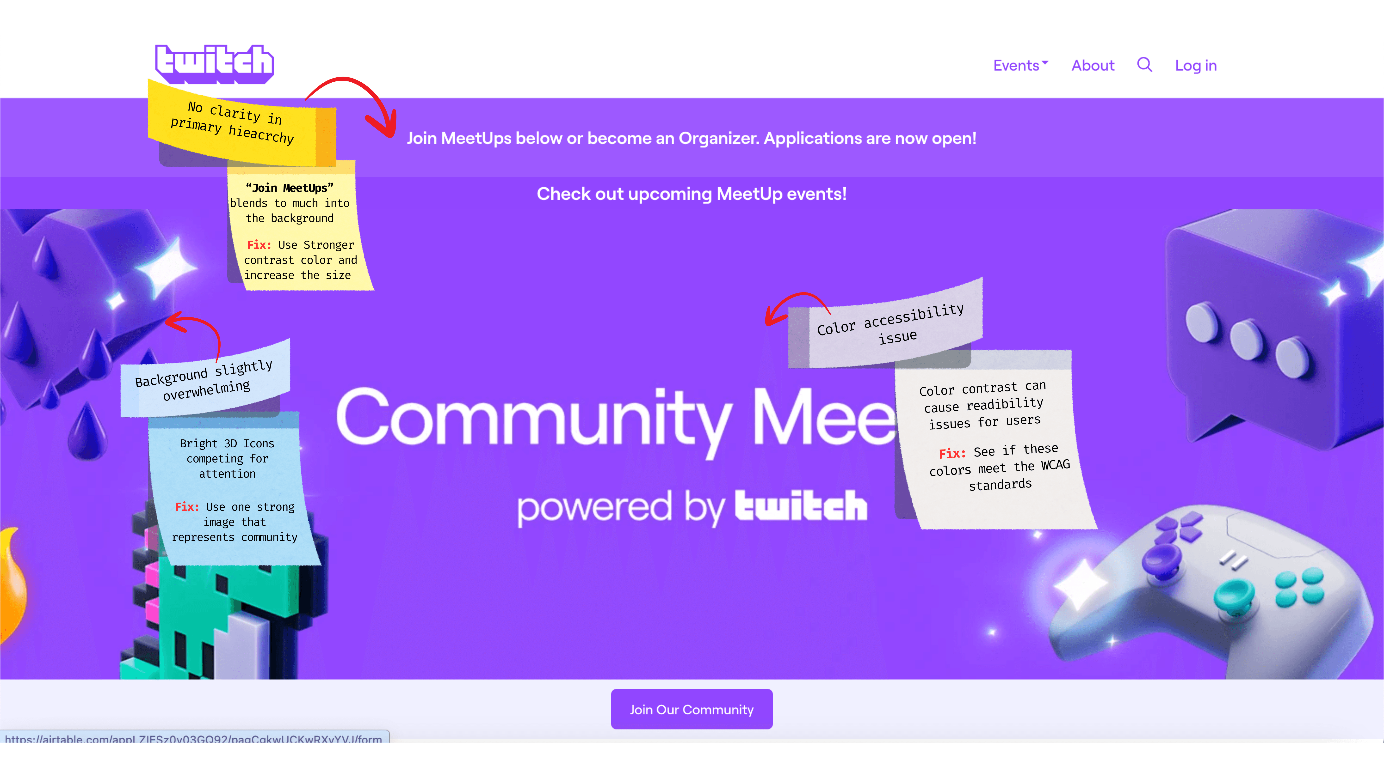
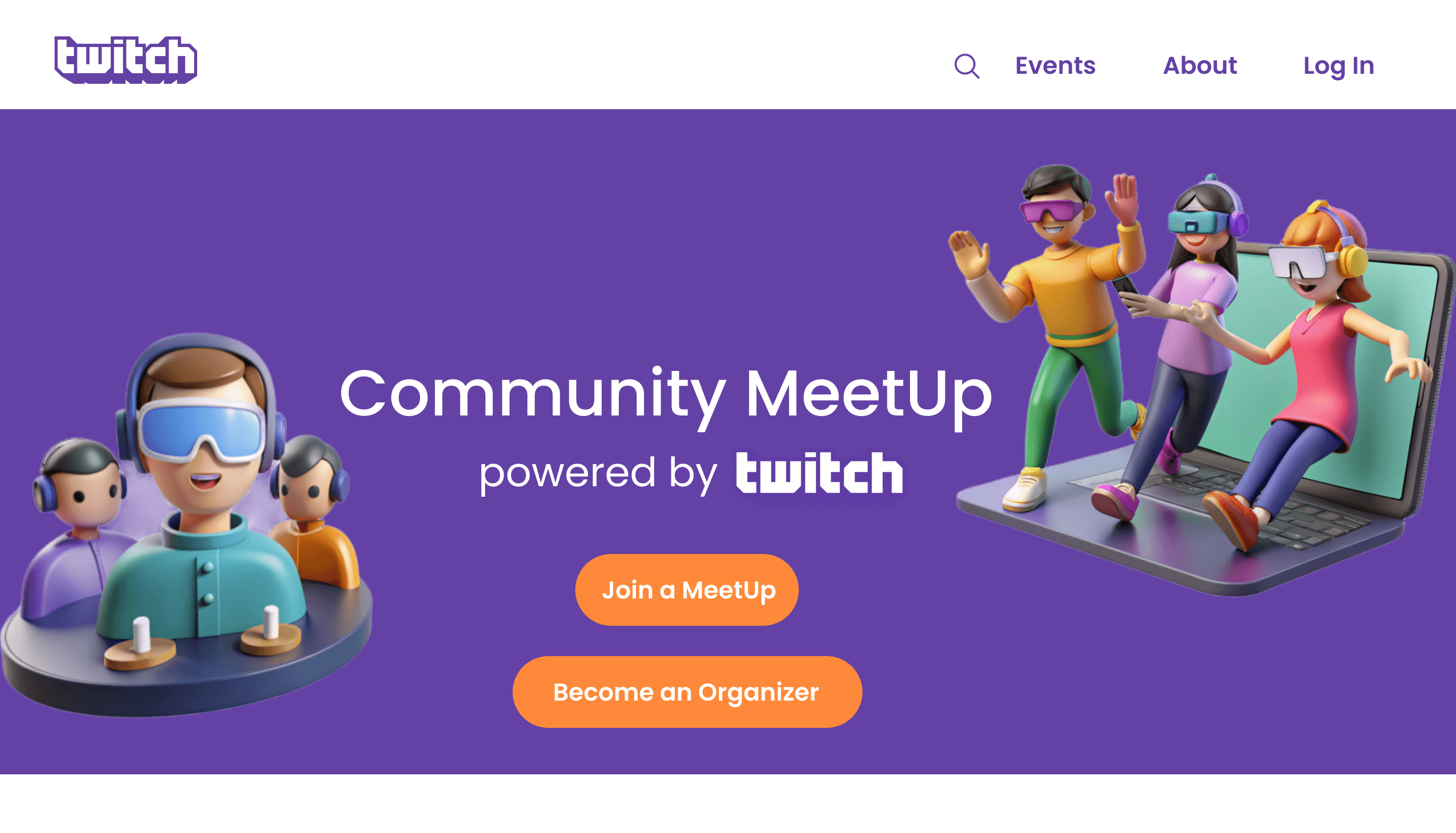
Screen 1 – Launch Screen
🔻 UX Critiques
No clarity in primary hierarchy
“Join MeetUps” blends to much into the background.
Fix: Use a stronger contrast color, increase button size, and clarify the label
Background slightly overwhelming
Bright 3D Icons competing for attention.
Fix: Simplify the hero visual and focus on one strong, on-brand image or illustration representing connection/community.
Color accessibility issue
Color contrast can cause readability issues for users.
Fix: Use color pairings that meet WCAG accessibility standards.
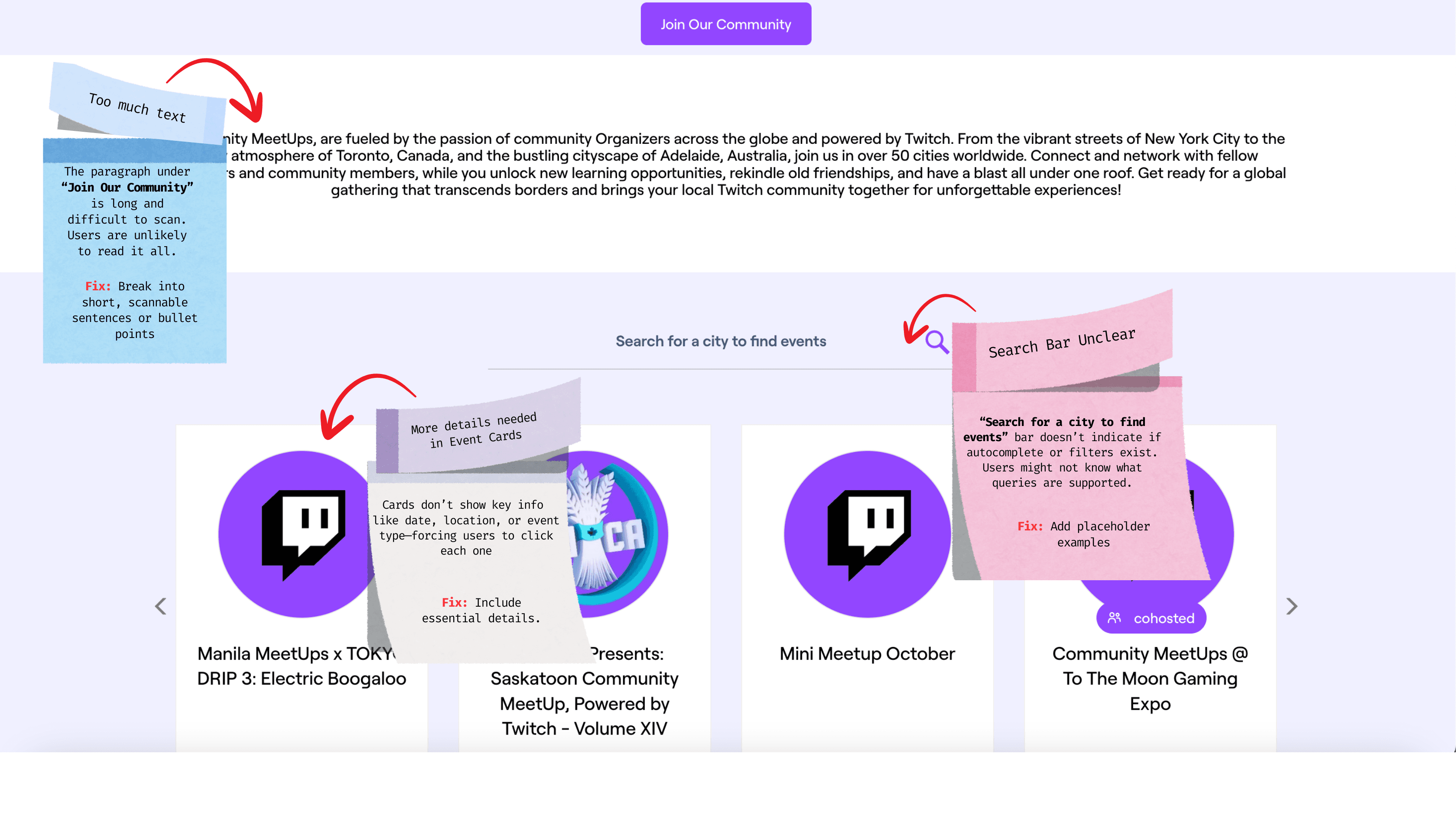
Screen 2 – Events Overview
🔻 UX Critiques
Too much text
The paragraph under “Join Our Community” is long and difficult to scan. Users are unlikely to read it all.
Fix: Break into short, scannable sentences or bullet points
2. Search UX is unclear
“Search for a city to find events” bar doesn’t indicate if autocomplete or filters exist. Users might not know what queries are supported.
Fix: Add placeholder examples.
More details needed in Event Cards
Cards don’t show key info like date, location, or event type—forcing users to click each one.
Fix: Include essential details.
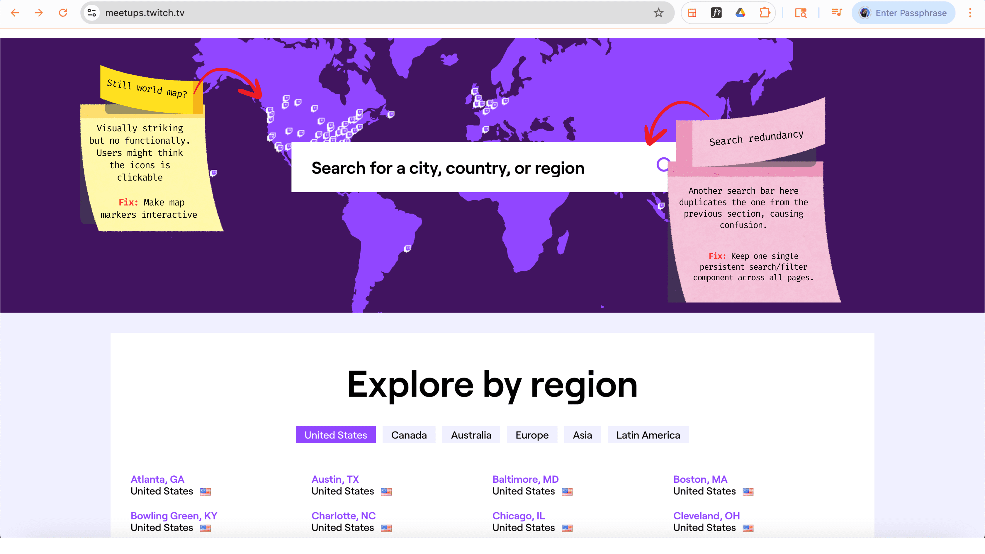
Screen 3 – Explore by Region
🔻 UX Critiques
Inefficient world map
The purple world map is visually striking but functionally weak. The small Twitch icons aren’t clickable or descriptive.
Fix: Make map markers interactive (hover/click to preview meetups), or simplify it into a static graphic and rely on search/filter for usability.
Search redundancy
Another search bar here duplicates the one from the previous section, causing confusion.
Fix: Keep a single persistent search/filter component across all pages.
Goal: Redesign the Twitch Community MeetUps experience to make event discovery effortless, meaningful, and true to
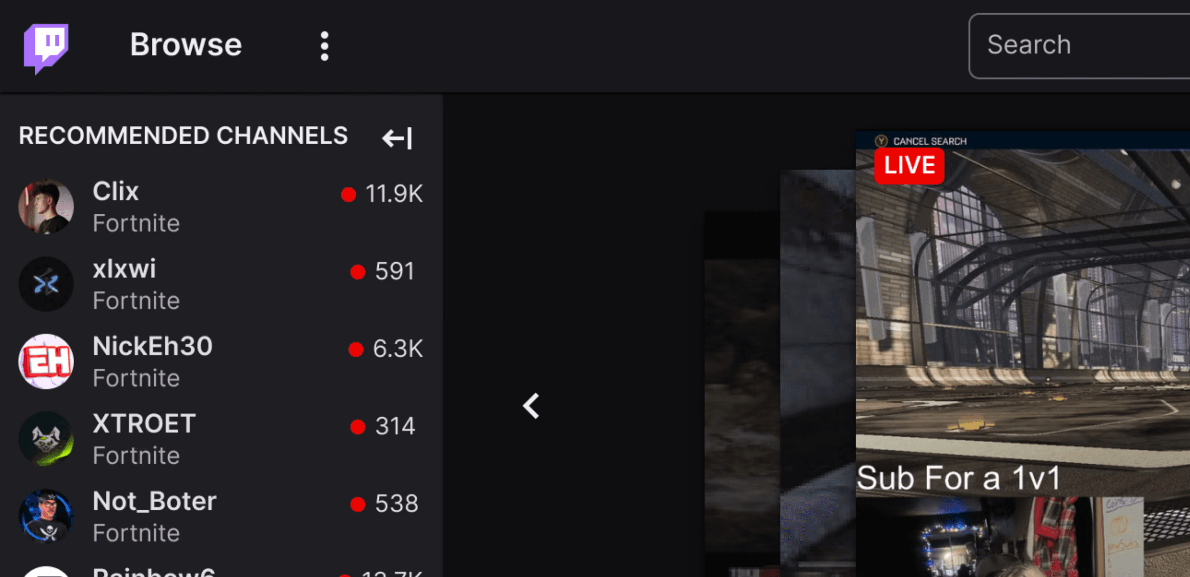
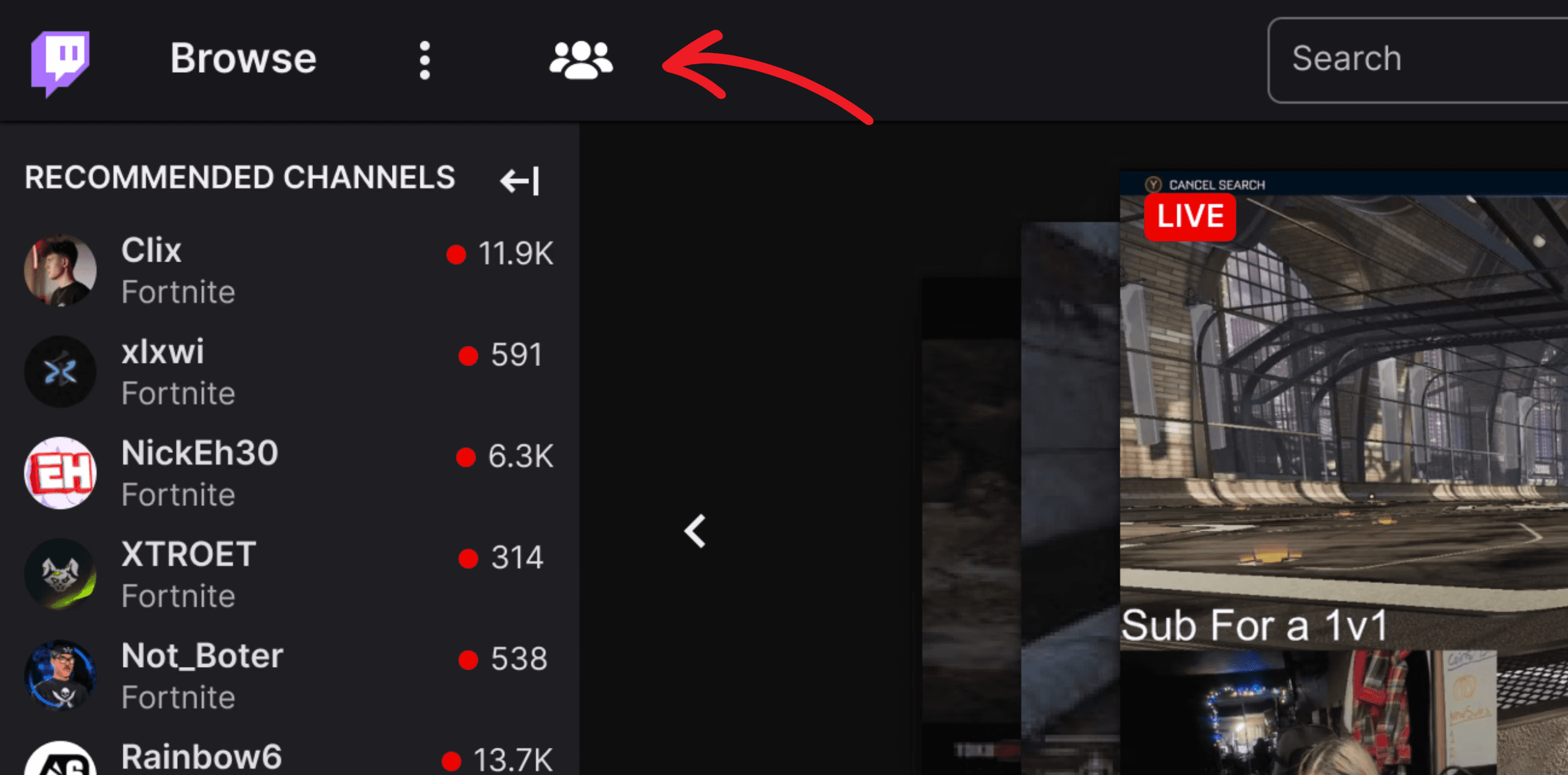
I noticed that Twitch doesn’t have a clear, direct way to connect people to the Community Meetups website. So, I added a small button that lets users know the community page exists. This simple addition can bring much more visibility to the community website.
Twitch Original Screen
Twitch Main Screen Redesign
Here's my redesign of the "Launch Screen" that fixes some friction areas: