
[OVERVIEW]
Tinder generates $1.94 billion a year. But paid subscribers dropped 5% in Q4 2024 and App Store reviews tell you exactly why: confusion, surprise charges, and a paywall that shows three prices before it explains one benefit. I applied for the Senior Product Designer role on Tinder's Revenue team and built this to show how I think about the problem they're hiring to solve. This is a speculative redesign of the Gold subscription upgrade flow, built around one idea: trust precedes transaction.
[THE PROBLEM]
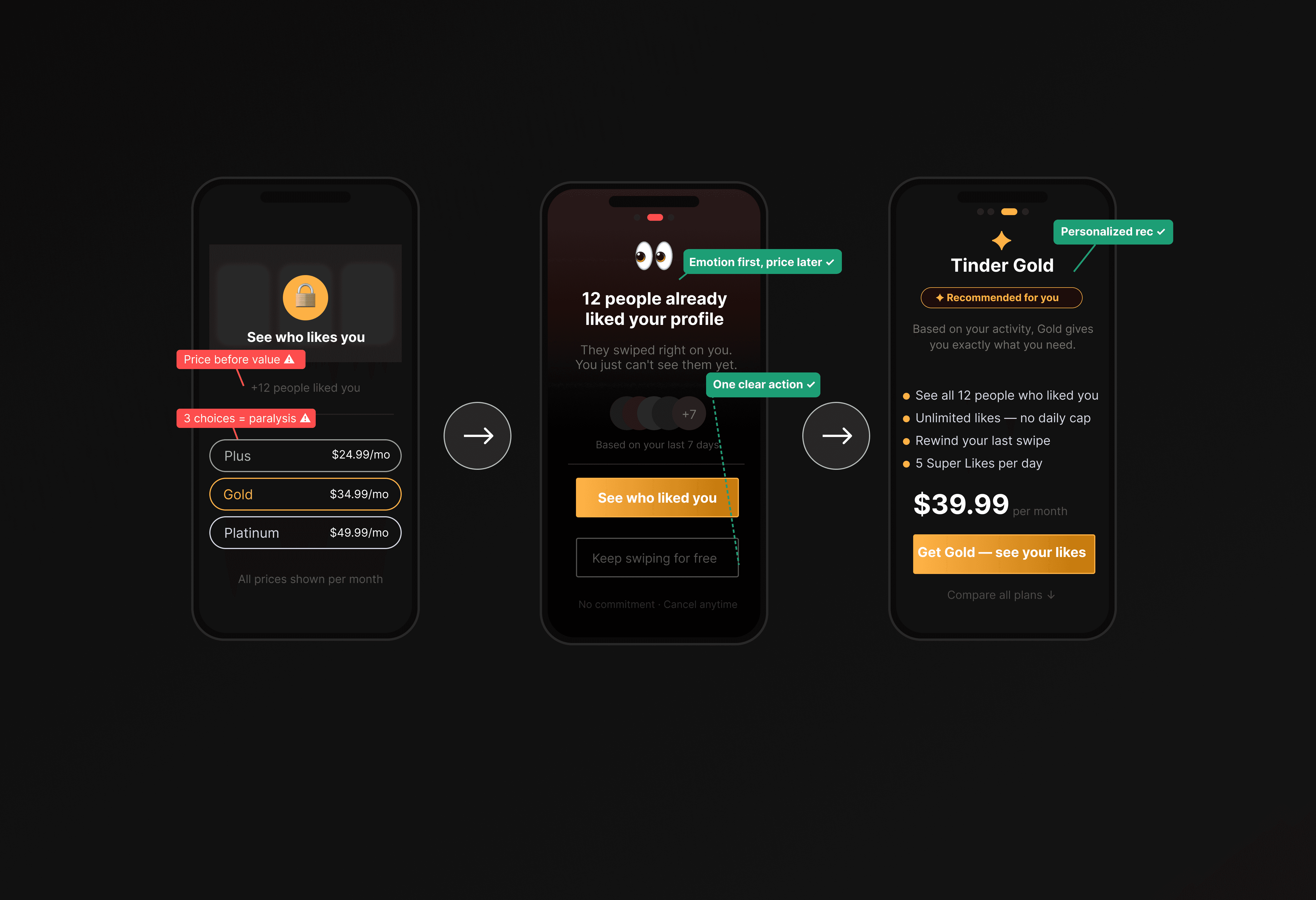
Tinder's current paywall opens with a pricing table. Three tiers, three prices, zero context, before the user has any emotional reason to care. Tinder founder Sean Rad said it best in his 2025 Goodwater Capital fireside chat: "The best revenue features actually improve the product ecosystem." The current upgrade screen doesn't do that. It interrupts the experience. This redesign tries to become part of it.
[DESIGN DECISIONS]
01 — Lead with curiosity, not price
The redesign opens with: "12 people already liked your profile. You just can't see them yet." No price. No tier comparison. Emotional stakes first, cost second. Users who understand why they're paying before they see the number convert with more confidence and cancel less.
02 — One recommended tier, not three
Showing Plus, Gold, and Platinum simultaneously creates decision overload before the user understands the value of any of them. The redesign surfaces one AI personalized recommendation based on the user's activity pattern, explained in plain language. Compare all plans is one tap away not removed, just not forced.
03 — Radical billing transparency
The #1 App Store complaint is surprise charges. The redesign shows the billing date, cancellation policy, and a renewal reminder explicitly on the pricing screen treating the user as an adult who deserves the full picture. Transparency doesn't reduce conversion. Hidden terms reduce retention.
04 — Immediate post-purchase value
After confirming payment, most apps return you to the home screen. The redesign shows a dedicated screen listing exactly what unlocked right now the 12 likes, the removed cap, the active boost. It closes the loop between the curiosity hook and the delivered promise. Post-purchase regret drives Day 1 cancellations. This screen reduces it.
[AI PROCESS]
I used AI throughout not as a shortcut, but as a thinking tool. ChatGPT helped me pressure-test 10 different emotional framings for the upgrade headline before committed to one. Figma AI generated layout variants for the tier recommendation card. v0.dev let me prototype the step-indicator interaction in a browser in 20 minutes instead of building a full Figma prototype. And I used ChatGPT as an adversarial reviewer after each screen "what would make a user anxious here?"
which caught two copy issues before anyone else saw the work.
[WHAT I'D MEASURE]
• CVR — free-to-paid conversion rate on paywall exposure (primary success metric)
• D30 Retention — did trust-first design reduce early cancellations?
• Post-upgrade NPS at 48h — did users feel the value was worth it?
• Early cancel rate — subscriptions cancelled within 72h of purchase
The best monetization doesn't feel like monetization. It feels like the product working.

